While I was Communications Manager at Pacific Forest Trust (PFT), the organization held roughly ten to twelve events a year. They ranged from small gatherings of donors or conservation partners, to forest tours for a few dozen, to seated dinners for 200—and everything in between.
Soon after I started in 2017, I was given the responsibility to manage PFT’s annual “Forest Fete” fundraising dinner and gala. At my previous organization, I had created visuals, coordinated AV, and created runs of show for galas and other events from the mid-2000s through 2016, among a number of other event responsibilities.
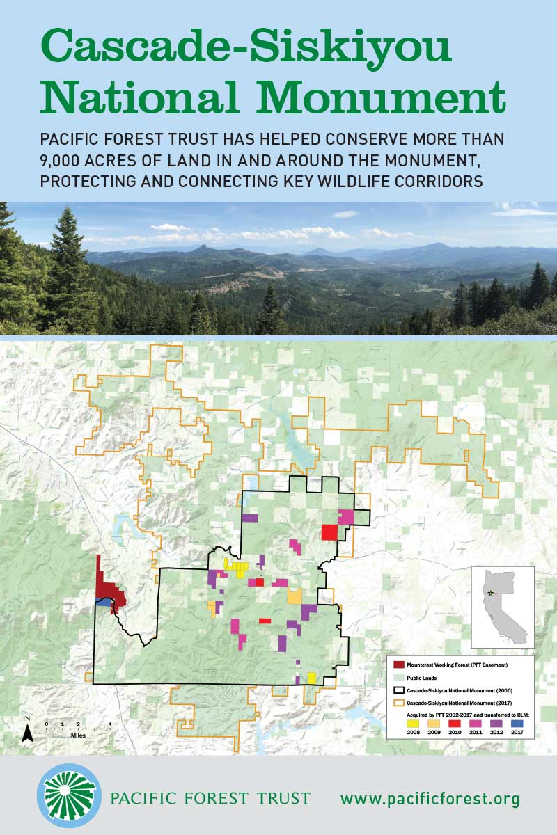
In 2018 and 2019, to provide consistent branding for PFT events that had a long shelf life, I designed posters that each covered a single conservation project or a geographic area of focus. These were displayed at events selectively, depending on location and audience; together, they told a concise but rich story of the hundreds of thousands of acres PFT has conserved.
These posters were printed as stretched canvas-style prints at 24″ x 36″ for visual appeal and durability. For maximum reusability, I worked to match them closely to PFT’s well-established colors and typefaces, keeping them consistent with the organization’s overall identity regardless of the nature of the event.
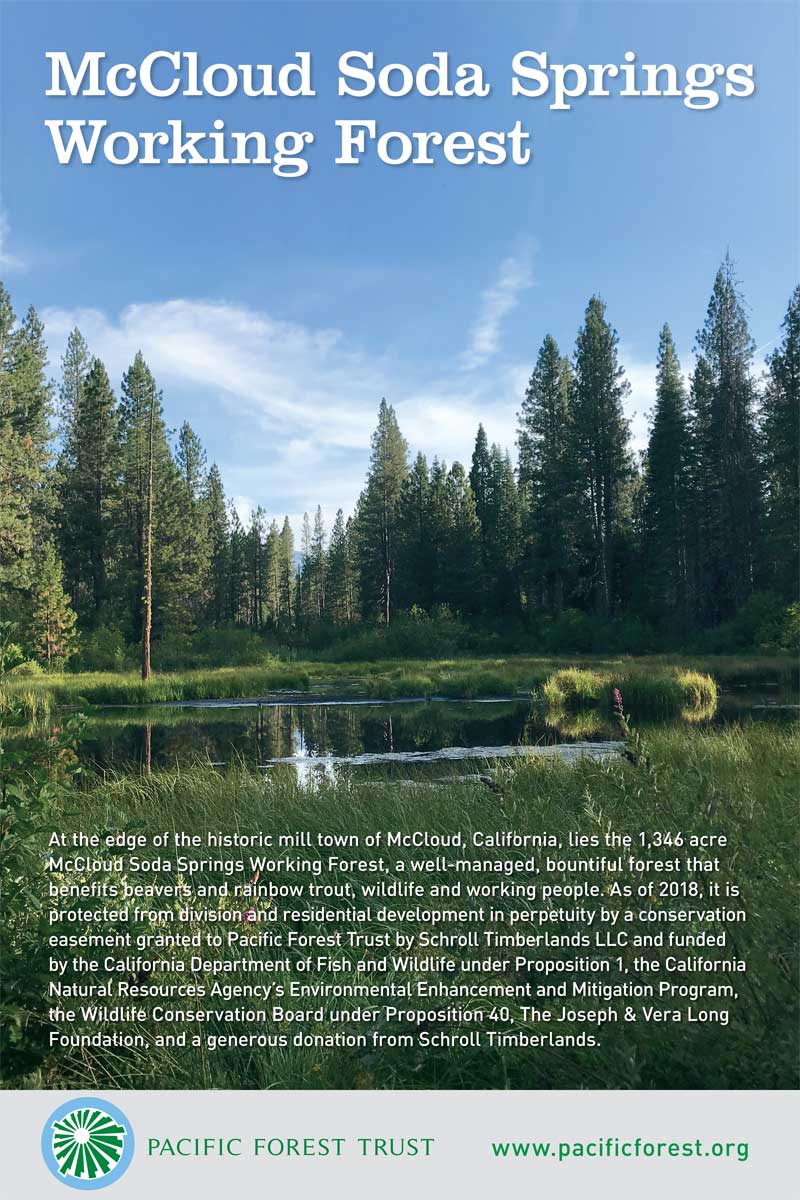
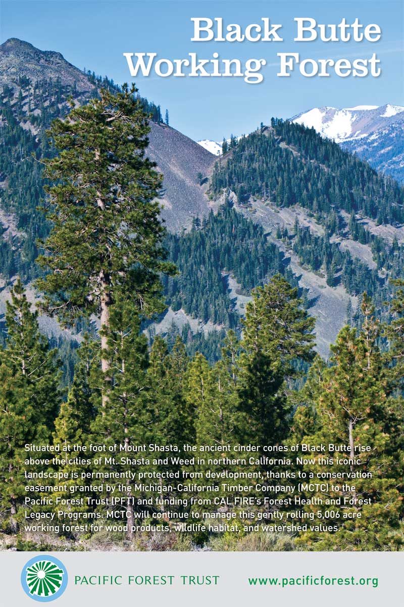
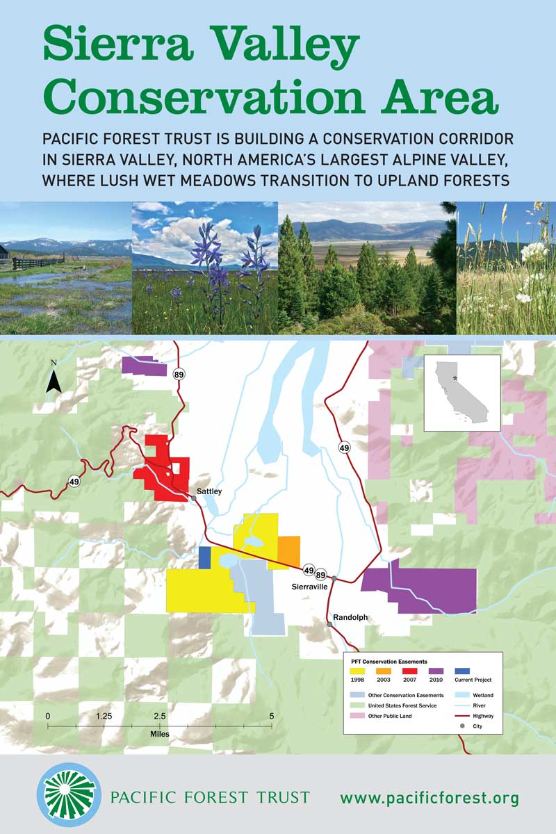
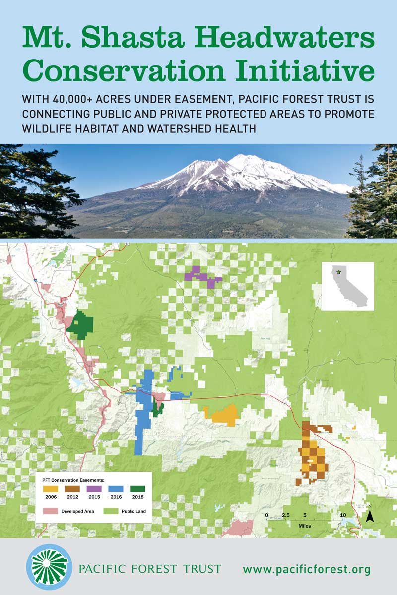
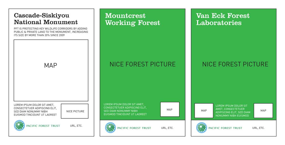
Below are wireframes of an earlier set of these posters I presented for approval of the basic concept.
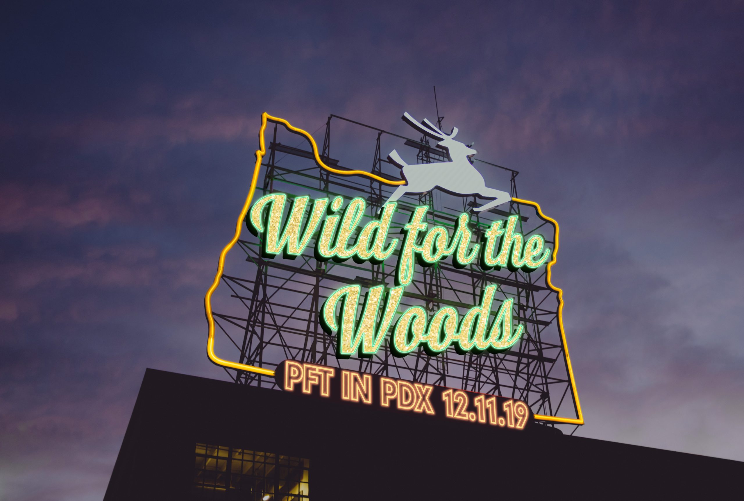
As PFT was building up its base of support in the state of Oregon, the organization held a free, casual reception in Portland in December 2019. To build excitement and attendance, staff brainstormed and came up with the phrase “Wild for the Woods” as the event theme.
In thinking about the visual identity to go along with that phrase, I considered the contrast between the focus on protecting rural forests and the event’s urban setting. In one of those “bolt of lightning” moments of inspiration, I thought of the former White Stag neon sign in downtown Portland (a city I’d visited a couple times at that point). Currently, the sign says “Portland, Oregon” but it’s had a variety of incarnations over the years. It occurred to me that I could use a photo illustration of that sign with the name of our event to create a typography-focused expression of Portland and Oregon as distinctive places and maintain a playful connection to the outdoors. I found a great photo on Unsplash, spent a little while in Photoshop, and designed this event theme.
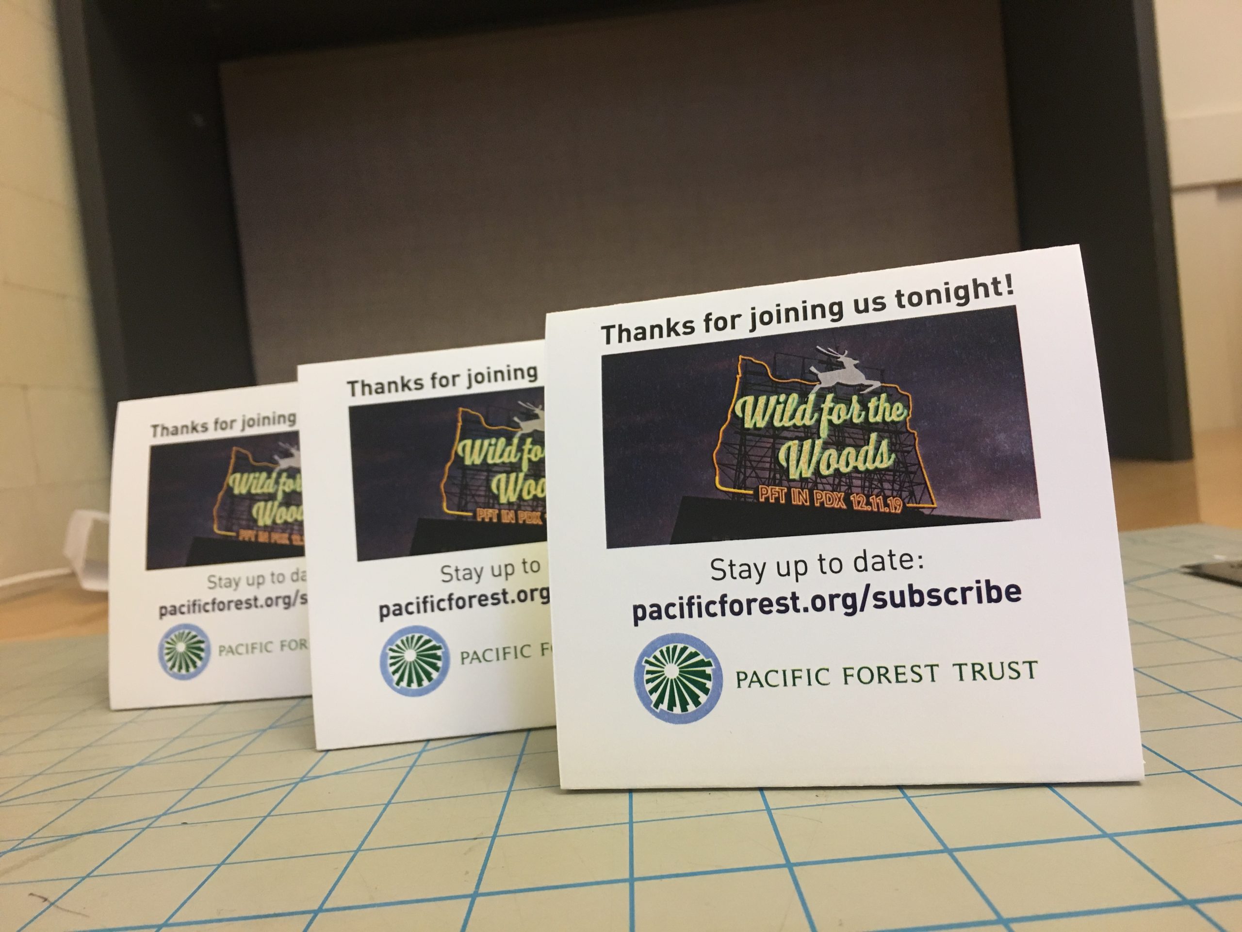
I applied the theme to web pages, emails, social media posts, and table tents to recognize sponsors. The table tents, printed in the office on light cardstock (which staff carried flat and folded on-site), were more economical and easier to transport from San Franciscon to downtown Portland than a traditional sponsor recognition sign would have been.
The interesting thing I discovered in designing this theme was how many things this giant neon sign has advertised since it was erected in 1940 (for more, see its entry in Wikipedia).