In August 2000, I was hired as web designer for the Minnesota Department of Natural Resources (MNDNR), a high-profile state agency with nearly 3,000 employees. A content specialist, a web developer, and I all started the same day, and along with our supervisor, our mandate as the “web team” was to redesign the MNDNR website (which served a dizzying array of departments, from hunting and fishing licenses, to state park reservations, to ecological services).
We consulted with a wide range of stakeholders both internal and external in a thoughtful and methodical way. About a year after the whole process started, we launched a completely rebuilt and redesigned website in the spring of 2002 that was used for six years. Some of the interesting features (based on the DNR’s deep knowledge of how people used their services and the website) included print-friendly layouts for event listings, automatically appended images that denoted PDFs and external links, and LDAP-based access control that allowed decentralized updating of specific areas of the site by specifically designated staff.
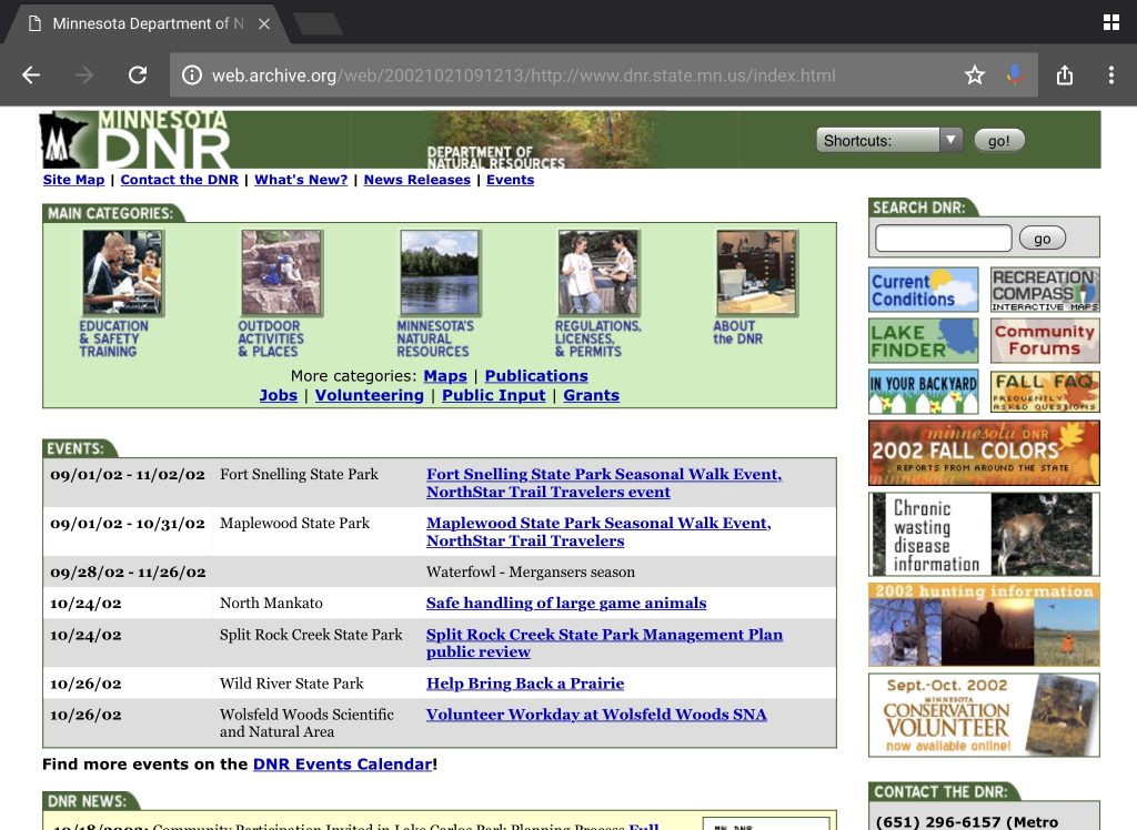
The site is basically intact on archive.org [aside from a persistent redirect issue that didn’t exist at the time], and to me it holds up well nearly two decades later.
As part of the project, I wrote this short piece that highlighted the changes:
Minnesota DNR Web Redesign: By the numbers
We have redesigned the DNR web site; here’s your guide to the ongoing changes. Our aim is a web site that is visually consistent, up to date, and easy to navigate.
Please note that since the site is so new, there may still be some broken links and errors in functionality. Any bugs you may encounter will be worked out in the near future. If you have comments on the new design, please email us.
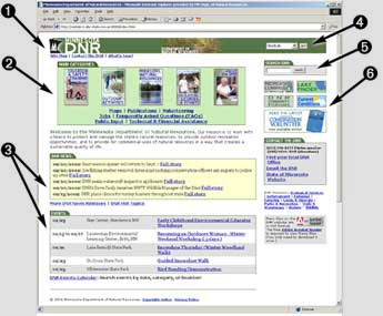
 Header. Headers give each page a consistent visual identity. Header graphics also indicate what section of the site you’re currently in. Below the header graphics, you’ll find links to functional areas of the site (such as our new dynamic site map). The header also contains the Shortcuts menu (see item 4).
- Home page navigation. Link to the main content of the site using our new topic-based organization scheme.
- News and events. See news and events from all over the state, as they’re announced, on the home page and throughout the site.
- Shortcuts menu. Take a shortcut to the most visited pages on the site using this menu.
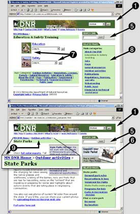
- Search from any page. Fewer clicks mean quicker access to the information you need.
 Featured links. These ad-like images promote areas of the site that are time-sensitive, popular, or simply interesting.
- Intermediate topic pages contain illustrated links to their sub-categories and pull-down menus that go even deeper into our vast store of content.
- The sidebar navigation on each page links to pages that are closely related to the topic at hand.
- Finally, our “drill-down navigation” shows you at a glance where you are in the site and how to get back out.
We think the new DNR site will make it much easier and enjoyable to find the natural resources information that you seek.
Again, please email us with your comments.
